
Tune UX Case Study
UX Design
Figma, FigJam, Illustrator
2024
A user-centered redesign for the Tune music app, aimed at solving the "black box" problem of algorithmic recommendations. The project introduced "Fine-Tuning," a feature that empowers users to actively shape their listening experience without disrupting their library organization.
The Challenge
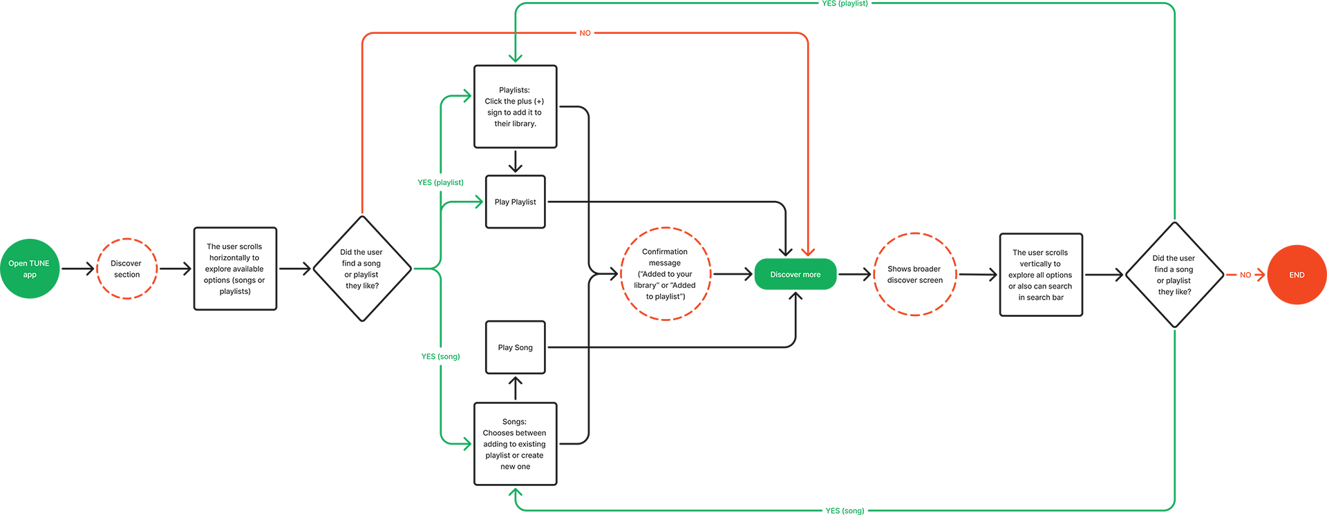
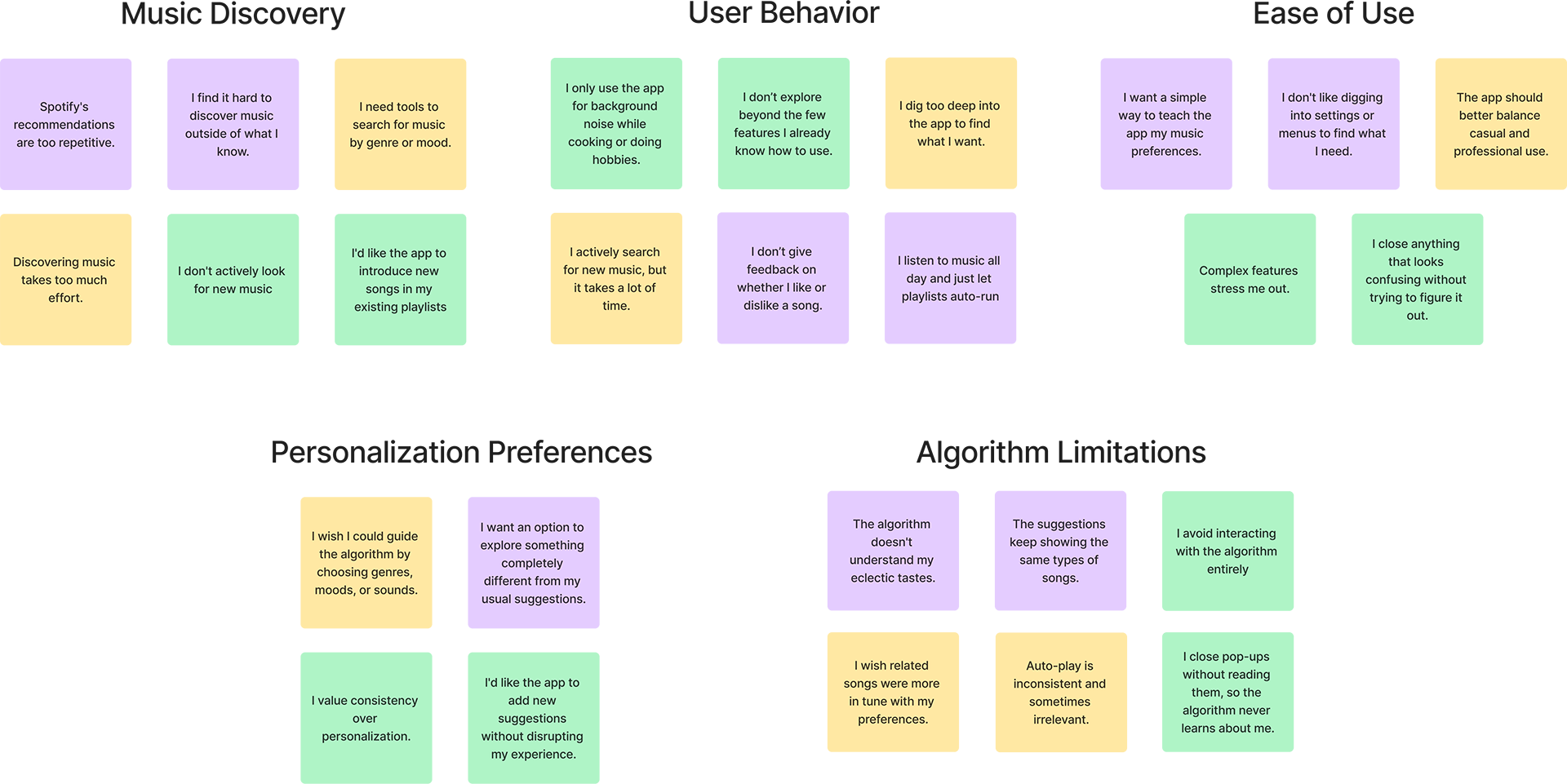
Users struggled with static, repetitive recommendations and a lack of transparency in how the app learned their tastes. Heuristic evaluation and user interviews revealed a critical disconnect: listeners wanted to guide the algorithm, but the existing interface offered no clear mechanism to do so beyond passive listening history.
UX Strategy
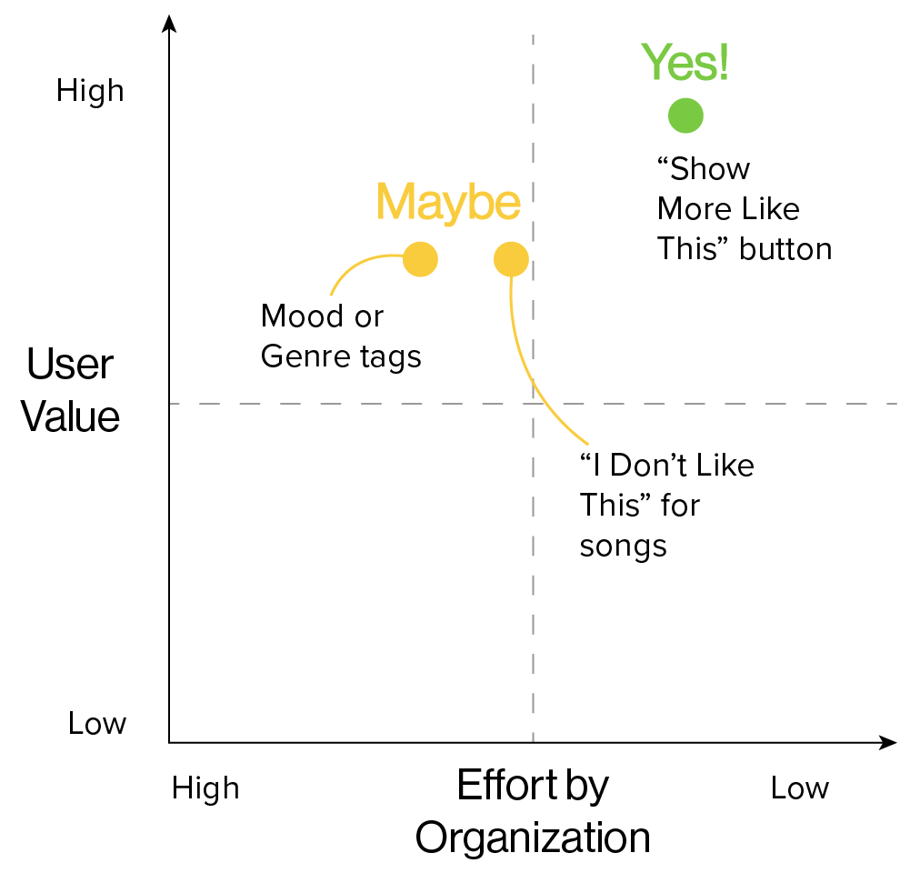
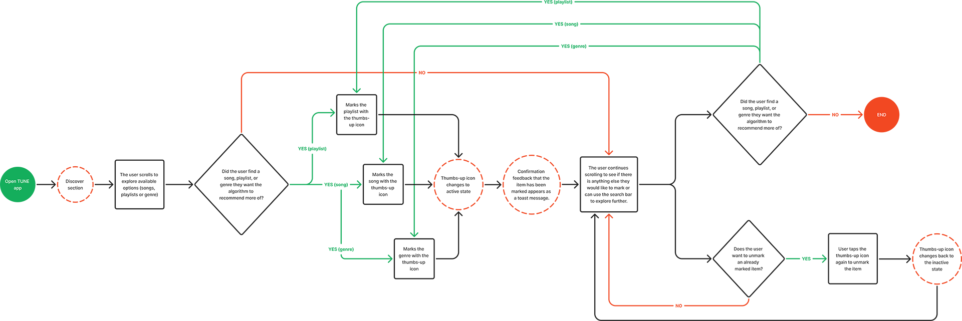
Research highlighted a need for a "middle ground" interaction, lighter than saving to a library, but stronger than a simple play. The strategy focused on "Dynamic Personalization": giving users a dedicated tool to signal preference. We prioritized a seamless feedback loop where users could "teach" the app what they like in real-time.

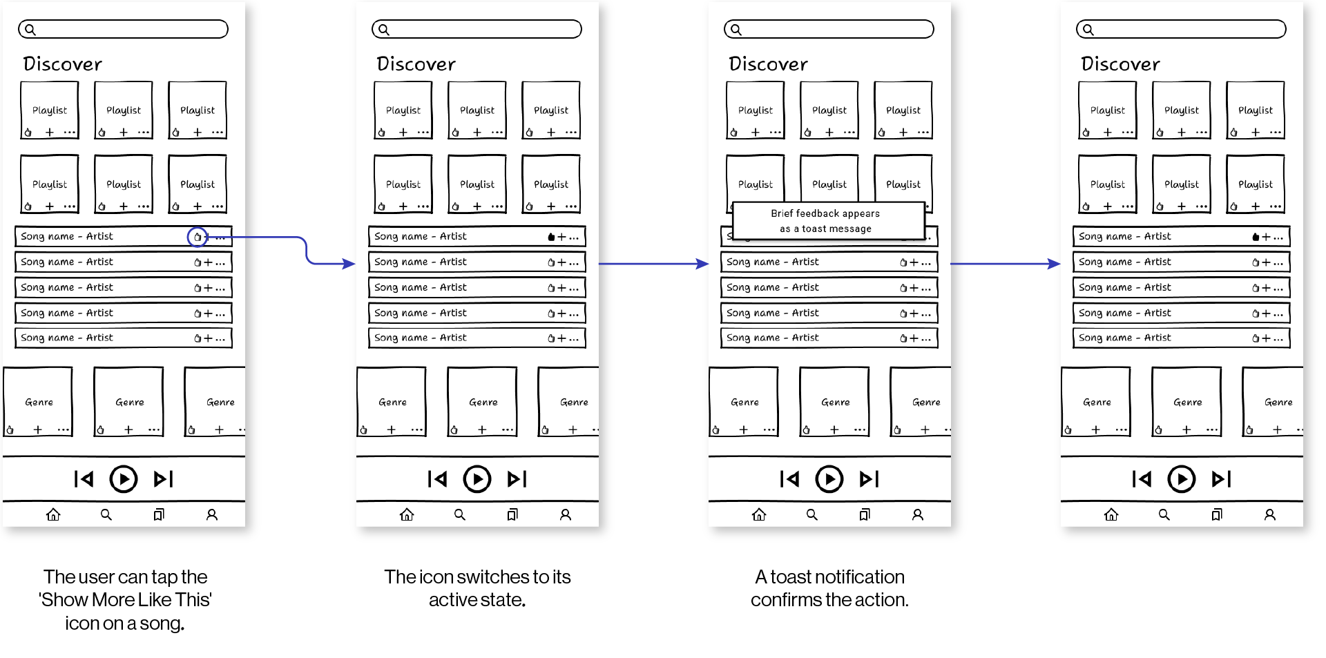
Iteration & Solution
The design evolved through rigorous usability testing. A key insight drove the pivot from a generic "Show More Like This" button to the branded "Fine-Tuning" ecosystem. This included the creation of a dedicated Hub and specific onboarding, transforming a hidden feature into a core value proposition that fosters trust and engagement.


Related Projects

AdaptEat UI Case Study
UI Design

farecrumbs
Branding, Creative Direction & Project Management

FHº Scholarship
Art Direction & Video Moodboard