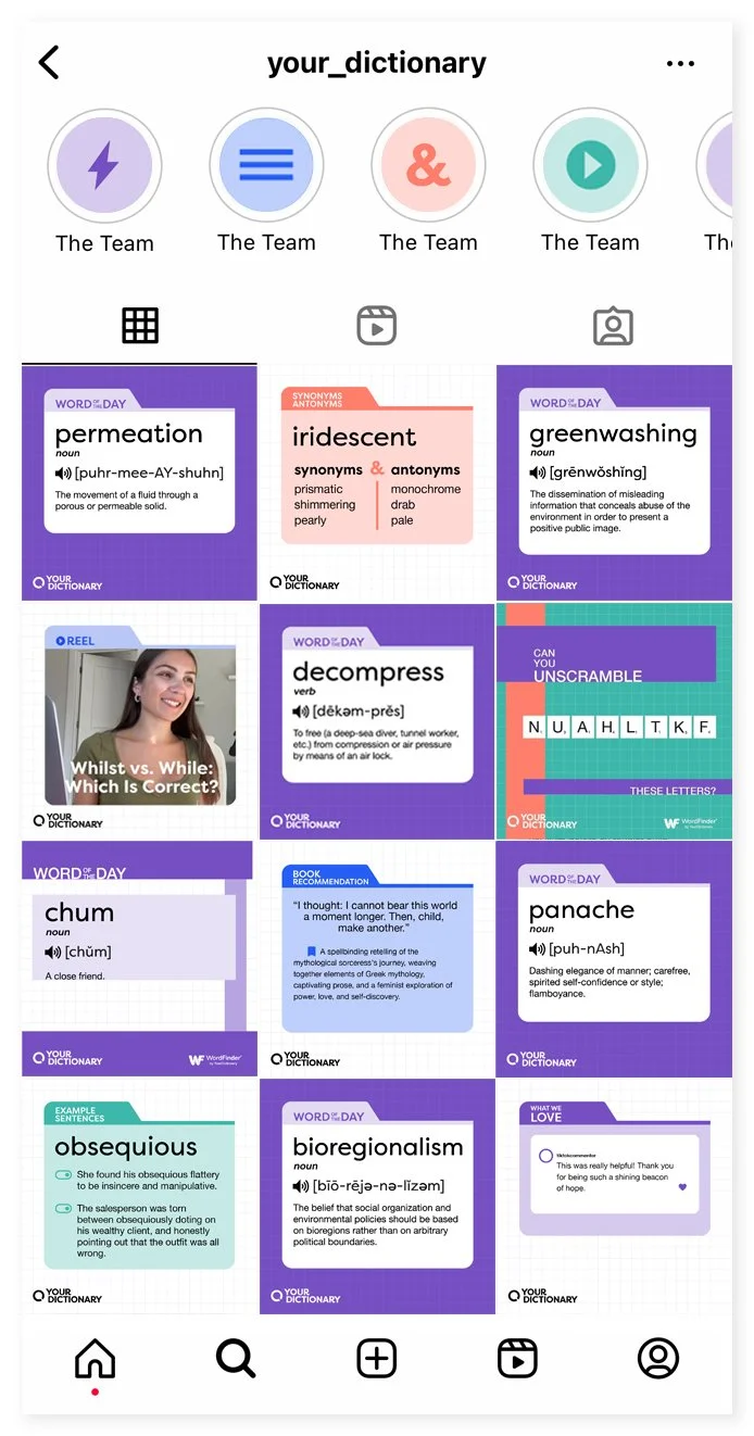
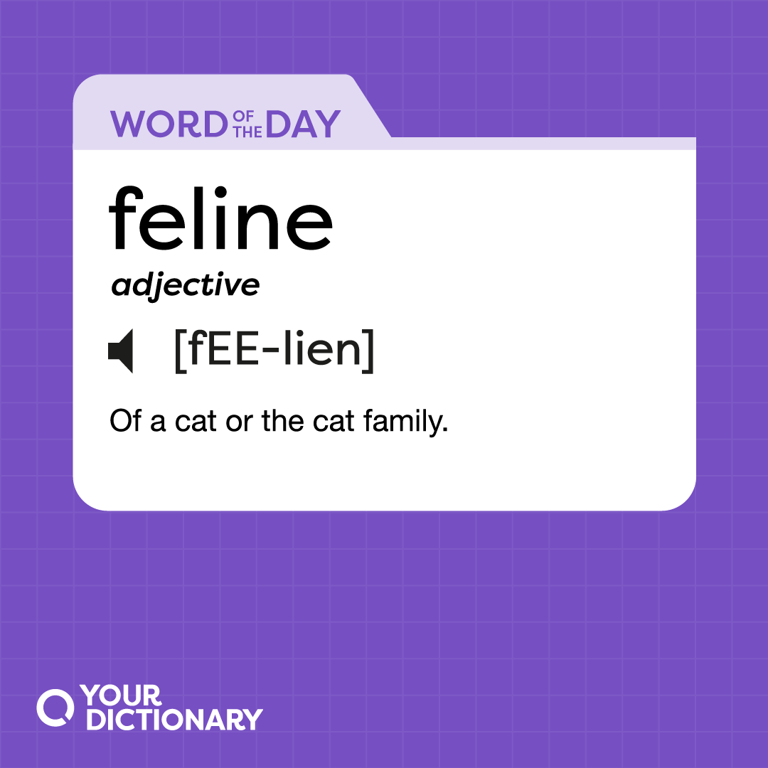
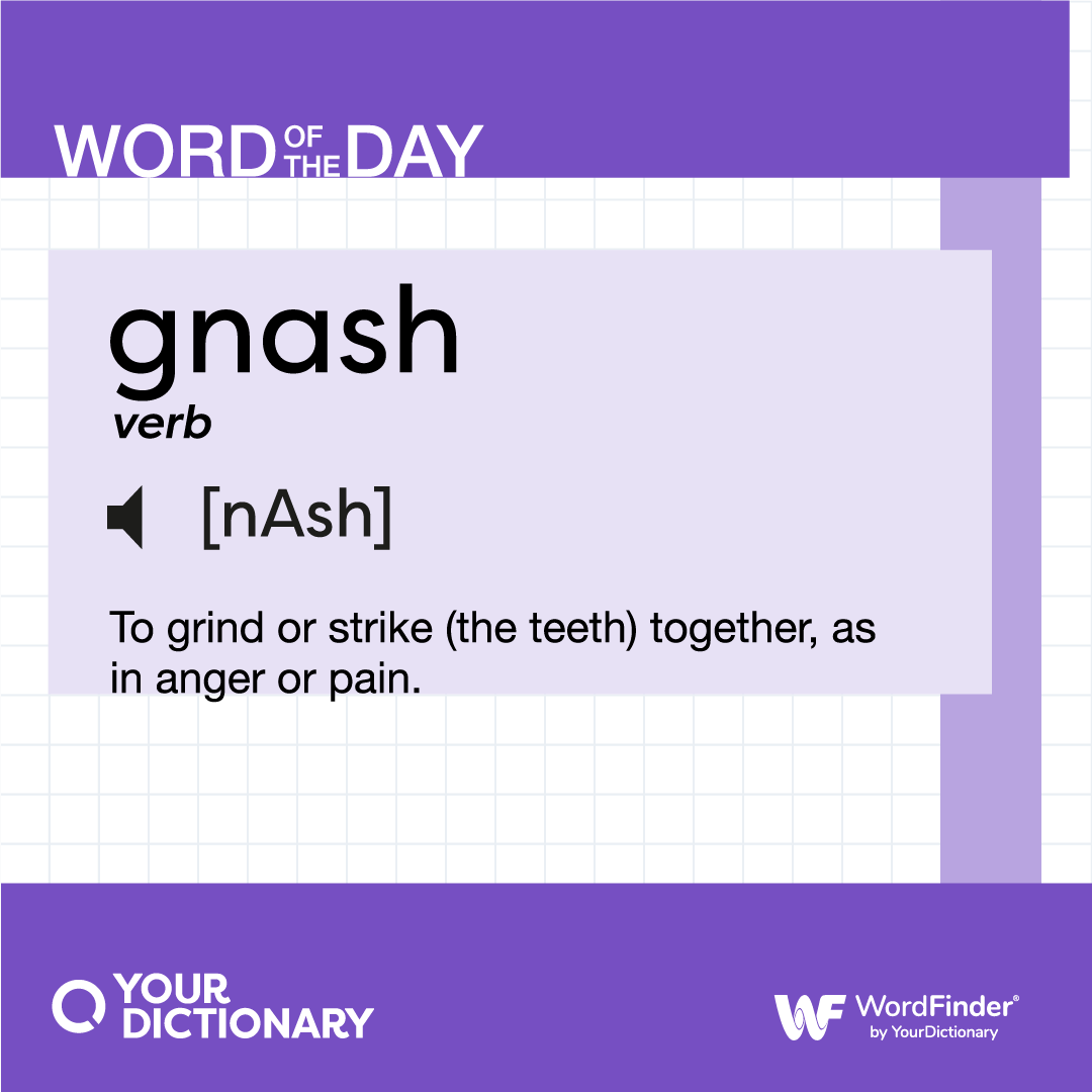
YourDictionary
Branding & Graphic Design
Illustrator, Photoshop
2023
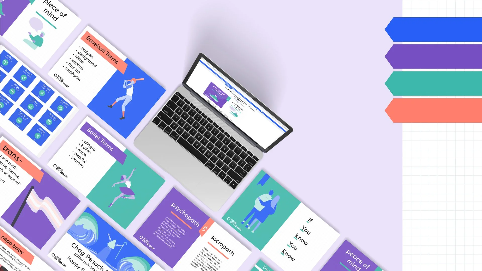
A comprehensive visual refresh to unify YourDictionary’s presence. The project focused on resolving brand fragmentation between the core website, blog articles, and social media channels to ensure a cohesive experience for a global audience.
Creative Direction
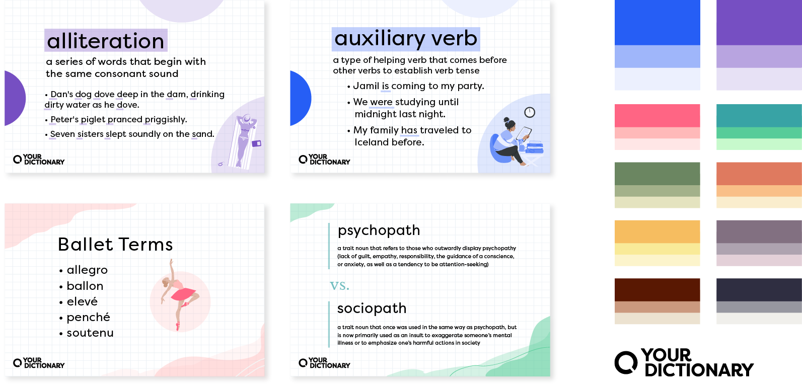
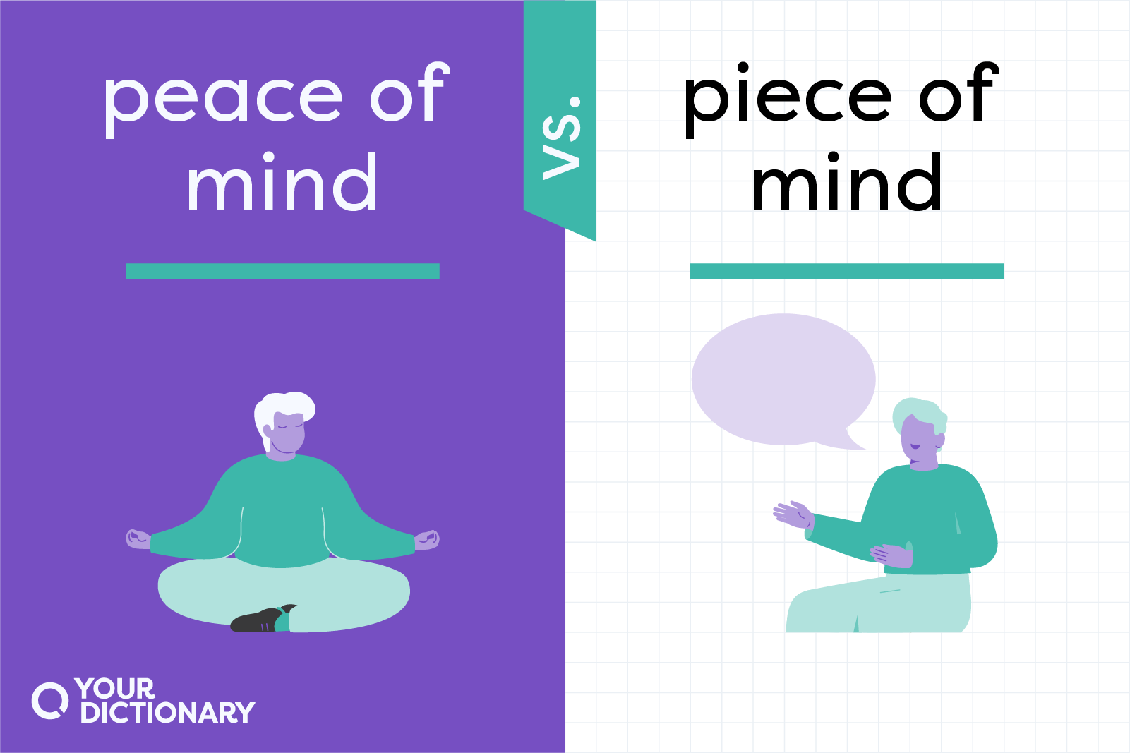
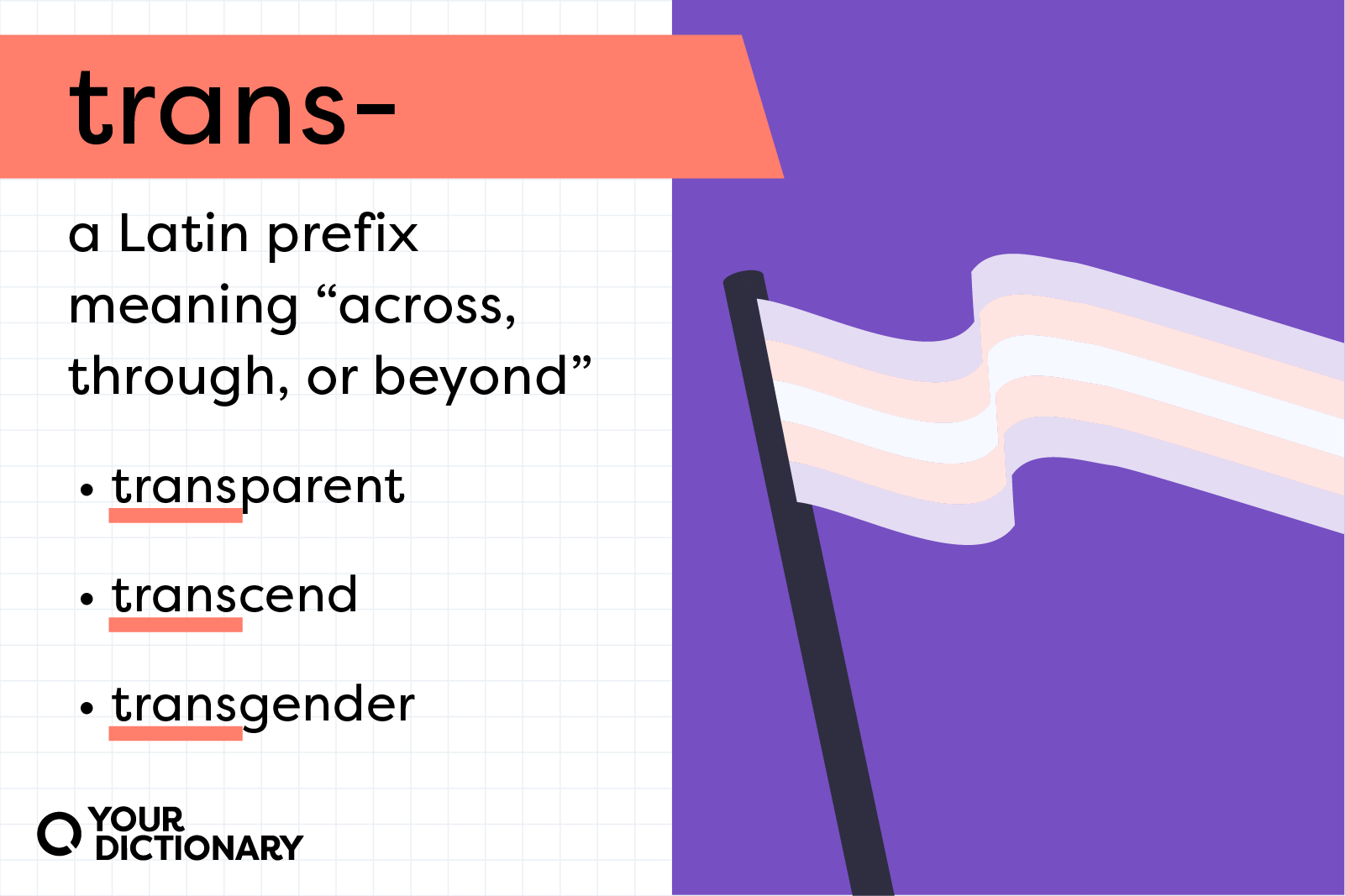
The strategy moved away from a generic aesthetic toward a bold, functional design system. By integrating editorial elements with the brand's signature notebook background, the new direction established a clear visual hierarchy that appeals to both students and adult learners.

Visual Identity
Brand noise was eliminated by consolidating the color palette into four high-contrast tones. A "ribbon" graphic device was introduced to anchor titles and structure information, creating a strict visual logic that ensures brand recognition across all touchpoints.


Final Outcome
The project delivered a flexible template system designed for maximum scalability. This modular approach significantly improved production efficiency, allowing for the rapid generation of consistent, high-quality assets for both web and social media.


Related Projects

AdaptEat UI Case Study
UI Design

Infographics
Infographics, Graphic Design
Crossword Helper
Branding, Graphic Design & Illustration