Crossword Helper
Branding, Graphic Design & Illustration
Illustrator, Photoshop
2023
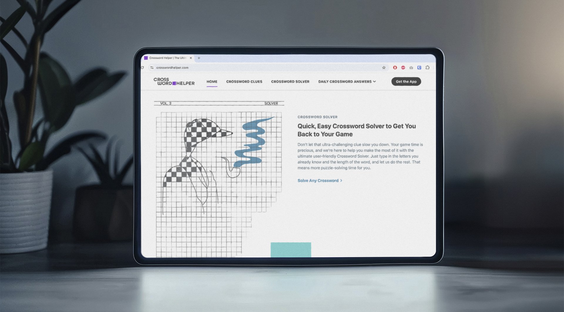
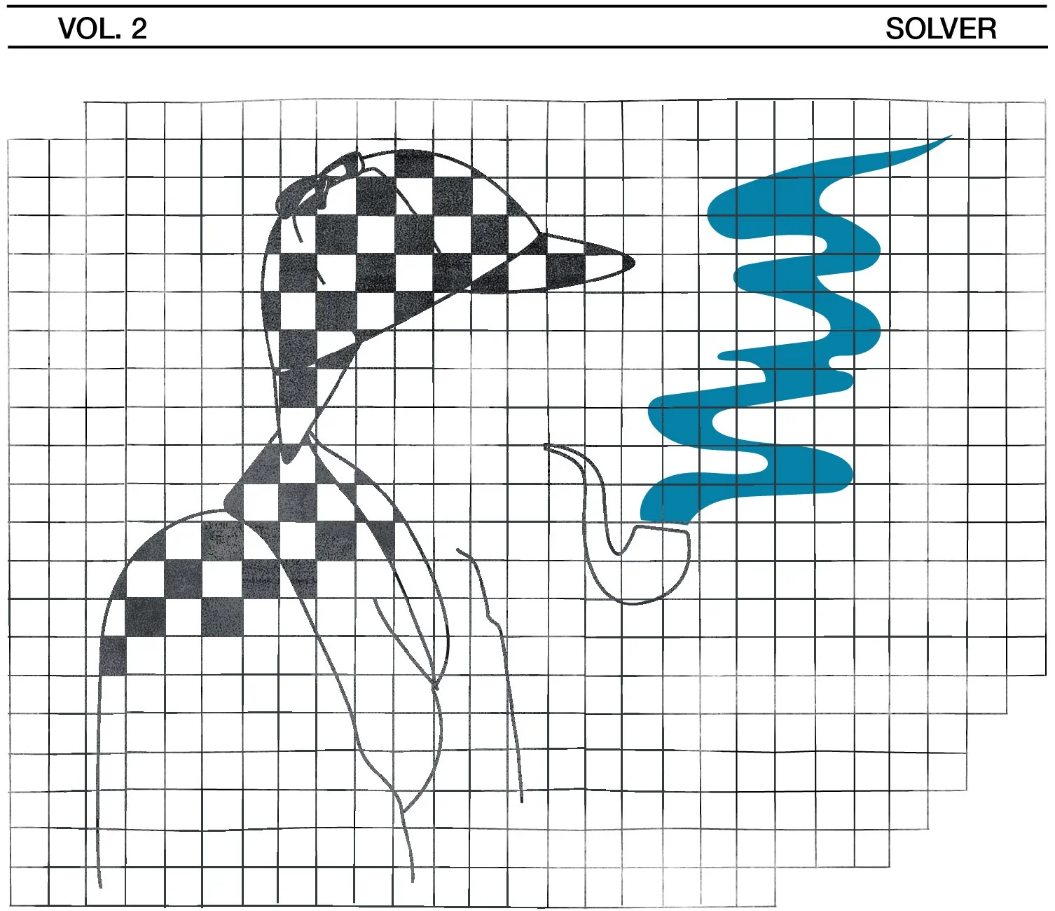
Created brand-defining illustrations and visual compositions for the homepage and error pages of Crossword Helper. These assets established the foundation for the brand’s graphic language, serving as a visual reference for future blog infographics and content.
Creative Direction
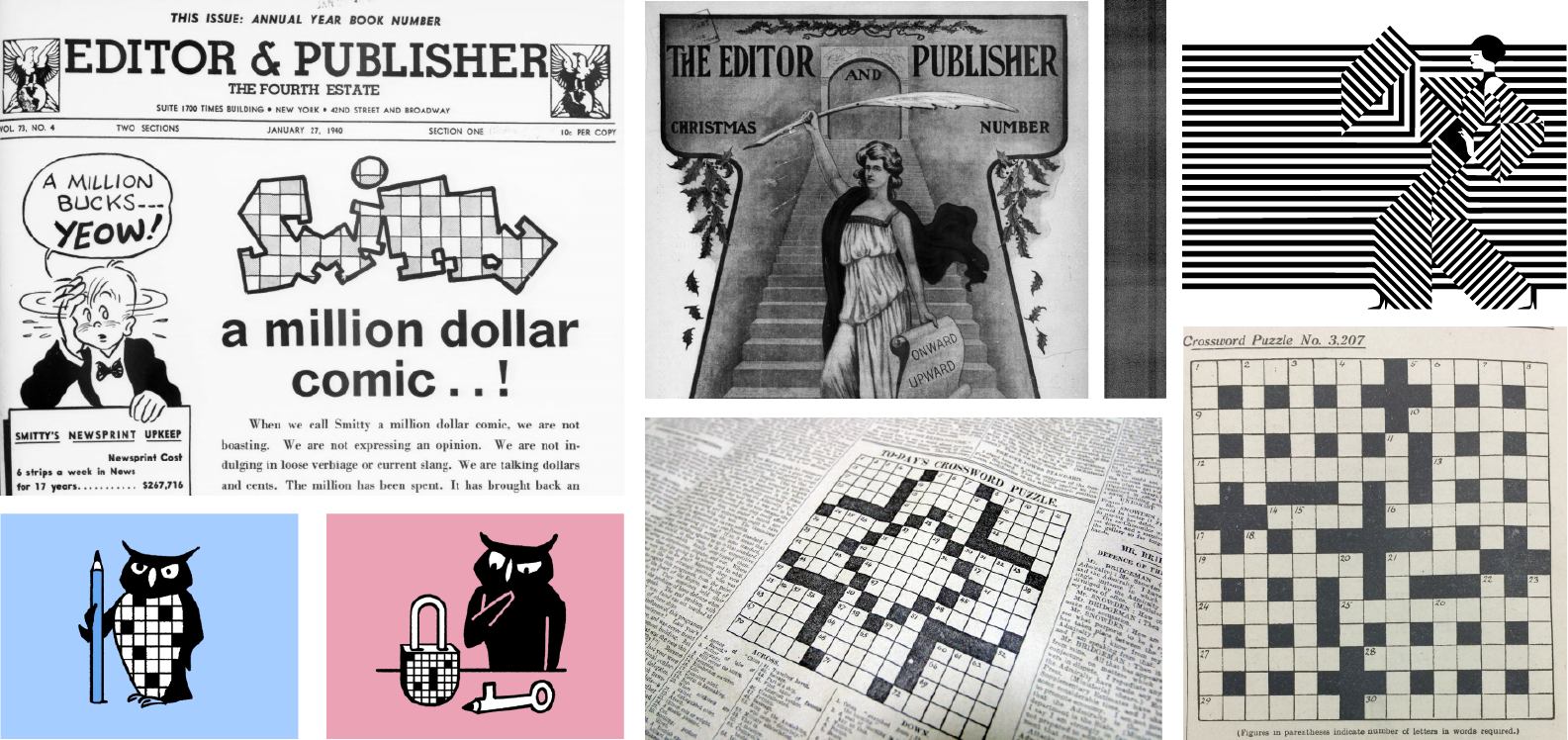
The visual approach draws from classic newspaper graphics and crossword grid structures, combining hand-drawn illustration with subtle optical rhythm. A restrained black-and-white base was paired with selective color accents to guide hierarchy while maintaining an analog, crafted feel.


Execution
Illustrations were developed using textured, freehand grids and layered ink-style elements. Key focal points were deliberately left free of pattern to enhance contrast and legibility, with color applied strategically to reinforce emphasis and brand recognition.


Final Outcome
The final illustrations balance structure and warmth, translating crossword logic into a distinctive, scalable visual system used across homepage sections and error states.


Related Projects
Word List Finder
Branding, Graphic Design & Illustration

YourDictionary
Branding & Graphic Design

farecrumbs
Branding, Creative Direction & Project Management