Elegance by Design
Art Direction & Generative AI
Midjourney, Freepik AI, Flora, ElevenLabs, Suno, Adobe Premiere
2026
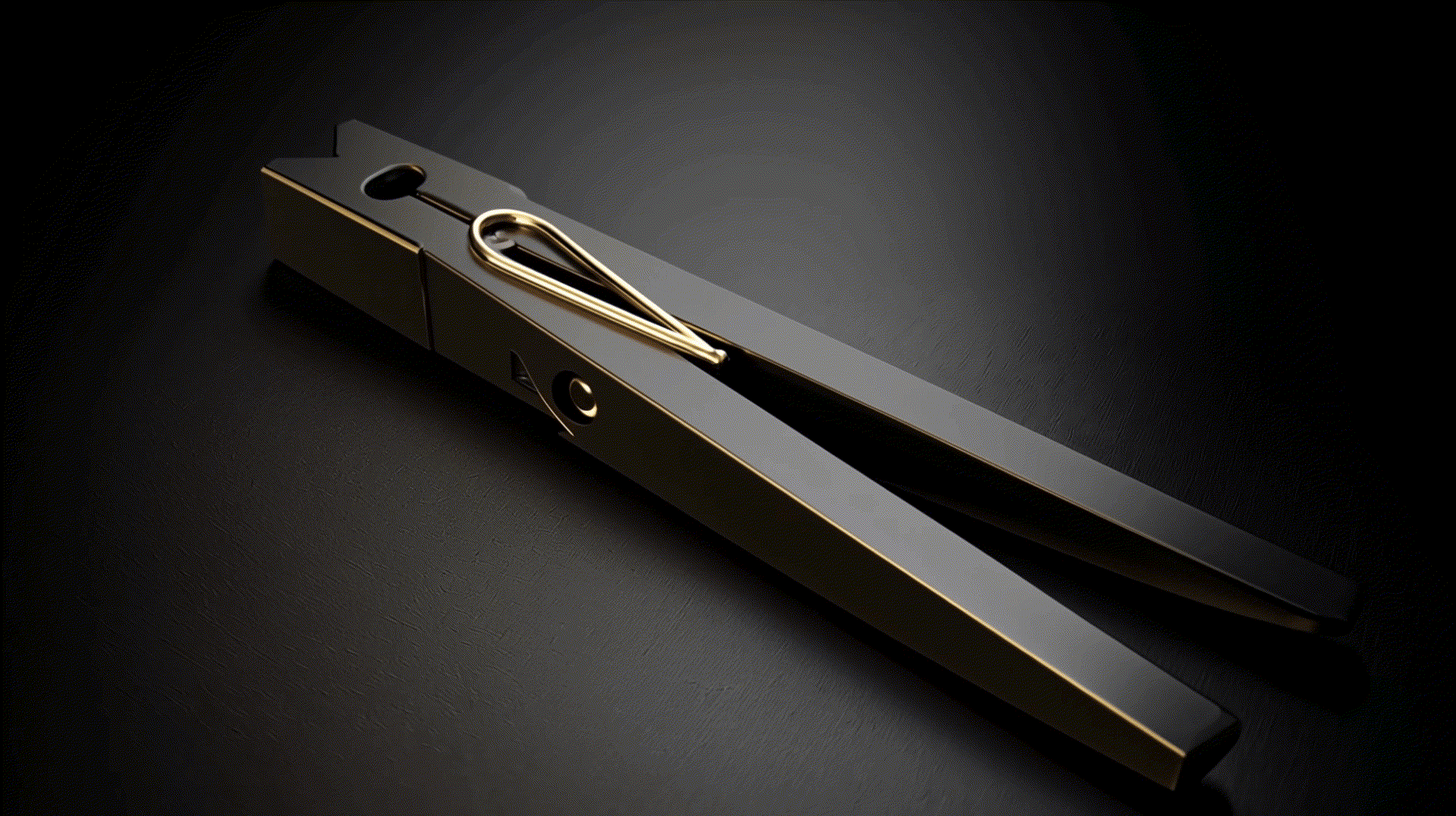
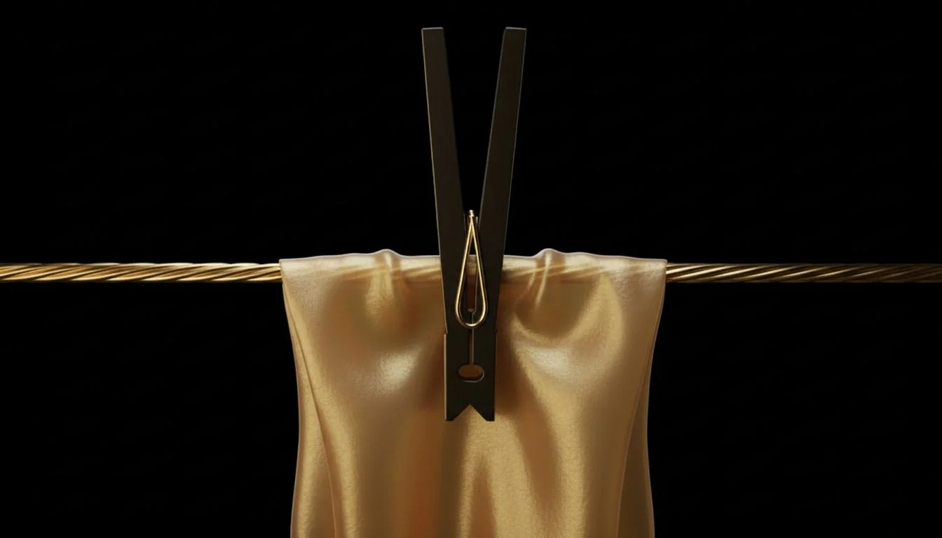
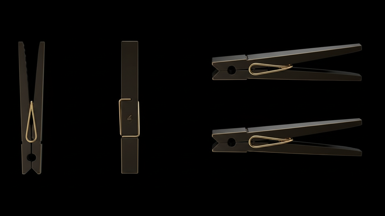
Directed and produced this piece to highlight the excellence of everyday design, using luxury visual codes to transform a standard clothespin into a high-end object. The project demonstrates the ability to execute a complete, high quality commercial video, taking full ownership of the creative workflow from initial moodboarding to final production.
Creative Direction
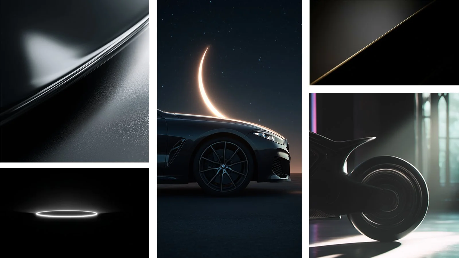
The visual strategy adopted the aesthetic codes of luxury automotive advertising. I prioritized a monochromatic satin black palette with brushed gold accents. Dramatic low key lighting and rim light were used to make the silhouette emerge from the darkness, conveying absolute sophistication and mystery.

Generative Strategy
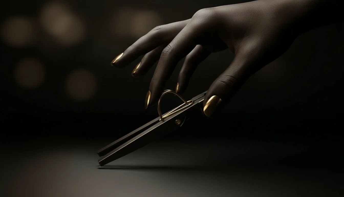
Producing the cinematic video sequences required rigorous prompt engineering to overcome AI model limitations. After identifying visual inconsistencies with human interaction, I pivoted the strategy to a pure product focus. Complex perspective challenges were solved by simplifying instructions and requesting technical object rotations to ensure a flawless premium aesthetic.
Final Outcome
The result is a meticulously crafted product reveal video. By integrating ultra smooth camera movements with custom AI generated sound design, the project delivers a highly realistic commercial grade experience, demonstrating how strategic simplification in AI can optimize resources and produce impeccable finishes.
Related Projects

AdaptEat UI Case Study
UI Design

YourDictionary
Branding & Graphic Design
Crossword Helper
Branding, Graphic Design & Illustration